ResearchPlus

Visual Identity

A visual identity for a new university group bringing together ten of the UK’s leading research-focused universities.

ResearchPlus visual identity, featuring a geometric symbol combining a yellow circle, grey triangular form and plus sign, alongside dark blue serif typography.

Ten institutions. One collective voice.

ResearchPlus is a university group formed by ten of the UK’s leading research-focused universities. The brief was to create a clear, distinctive identity that could bring those institutions together under one shared banner.

Working closely with stakeholders from each institution, we developed a unified brand for launch, including the logo, visual guidelines and a range of print and digital communications for the inaugural event at the House of Lords.

ResearchPlus launch event booklet.
ResearchPlus launch event booklet open spreads.
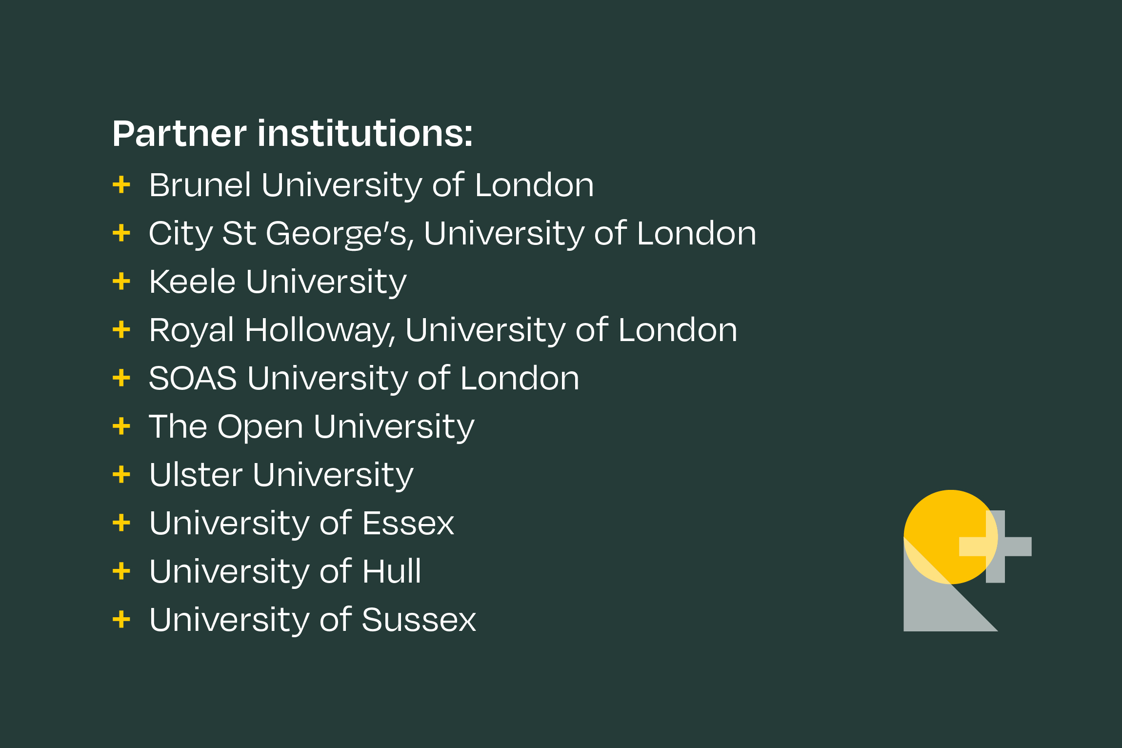
Graphic showing ResearchPlus university members.
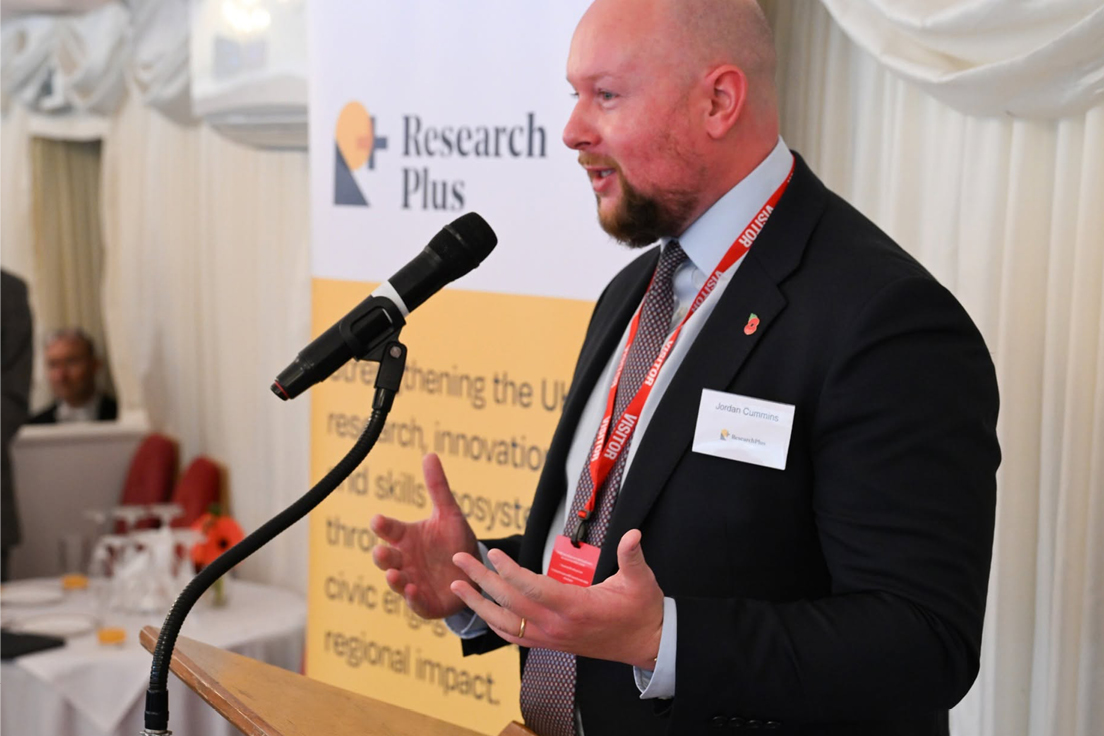
Man speaking into microphone infront of a ResearchPlus banner at the launch event.
ResearchPlus website showing monochrome image and member logos.
ResearchPlus tote bag using line version of the R+ symbol.
s	Overview of the ResearchPlus visual identity guidelines, showing logo variations, colour palette, typography, imagery and examples of branded publications and banners.
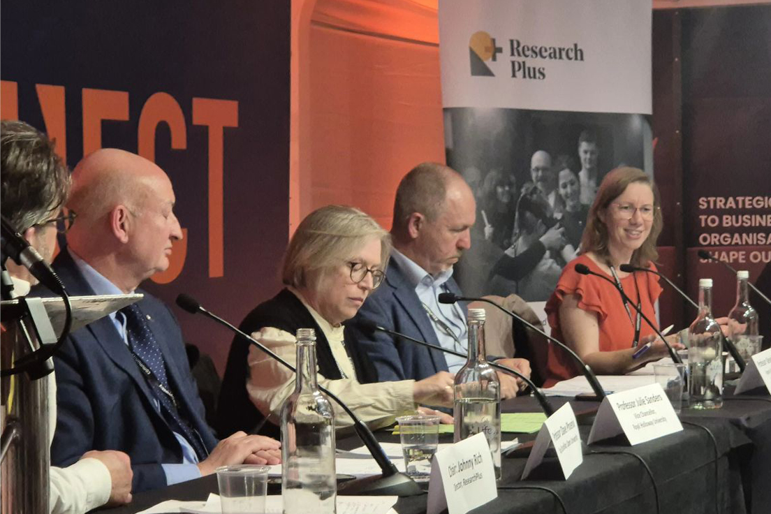
Panel discussion at an event, with a ResearchPlus branded banner displaying the organisation's logo behind the speakers.
Enlarged detail of the ResearchPlus geometric symbol, featuring overlapping circular, triangular and plus shapes in shades of yellow.

Have a project that needs a clear point of view?

Let’s talk it through →